 |
|
||||||||||||
|
Columns by Nancy K. Austin: Everyone's a Critic... Even You
List all of Nancy's columns
Visit our other Getting Work Columnist
|
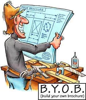
The last time we got together, I raved about the IP's dream marketing tool, the brochure. If you read that column, you already know that I've got a jones for these perfect pieces of persuasion. In this column, we'll see how a clear focus, a smidgen of that legendary IP ingenuity, a little help from your friends, and modern desktop technology combine to let you create a boffo brochure. Q&A=Brochure Copy. Writing copy for your own brochure can be a real bear. To make the experience less ursine, I suggest the following: tape-record a little Q&A session between you and a pal. You supply the questions, your cohort quizzes you, and you capture on tape the ensuing conversation, which will, in turn, germinate into robust copy that captures the two or three key ideas you want your brochure to emphasize. The great thing about this process is that it can foil your attempts to write insipid nonsense, like the brochure equivalent of the Muzak version of "Muskrat Love." For my first brochure, I roped a friend into interviewing me. I supplied her with half a dozen questions about my background and business -- How did you get started? Why is it so hard for companies to innovate? What do you tell critics who say your book is nonsense? -- and we sat down one afternoon for a little tape-recorded tête-à-tête. Once I got warmed up, I found that one question would lead me to comment on something that probably wouldn't have occurred to me otherwise, which in turn opened up a whole new topic. Sometimes my friend would hit me with a little pop quiz of her own, which also enriched the process. When we transcribed the tape, we had a goldmine of descriptive phrases and sentences that sounded authentic, like me, instead of dreaded brochurese, an affliction you should avoid at all costs. Also thanks to this format, we had a built-in conversational tone as opposed to grand, abstract oratory -- important because your brochure will be read by one individual at a time. The Barbara Walters approach is, hands down, the best way to generate content you can use. Take the transcript of your Q&A session, and from that dialogue produce three or four paragraphs about who you are and what you do. Just please keep this short and snappy -- two or three sentences per paragraph, 200 words max. That's about half of a regular page, double-spaced -- plenty of room to introduce yourself, get across your uniqueness and special qualifications, explain the results you promise to deliver, and ask prospects to contact you for more information, a price quote, or to place an order. Write as if you were sitting in your kitchen, in the middle of relaxed conversation over coffee with a good friend. That is to say, use kitchen English, not sit-up-straight-and-comb-your-hair-and-smile-for-the-camera English. Present yourself intelligently and eloquently, but without bombast. Toss the Testimonials. Direct-marketing mavens often say brochures should be embellished with big, showy endorsements from happy customers. Not so fast. I mean, does that idea ring cherries for you? Even if you're flush with fans who burble and coo over your work, it's overkill to burden a perfectly decent brochure with all that slobber. When you pick up an IP's brochure and read a billion blurbs about how "important" and "much sought-after" he is, you do what I do: drop the thing like a Palmetto bug and go wash your hands. Instead, to show that you're the real deal who has attracted a respectable clientele, put your client list (or a subset if you have loads) on a stand-alone card you can tuck into your brochure. The obvious advantage is flexibility; you can reprint a client card by itself, any time. That's a big plus when you consider that you might be less than thrilled to have your good name shackled to certain companies until your next press run, maybe five years from now. Or, skip the client list altogether and devise a card or page headlined "What the Press Is/People Are Saying About Fetzinger Fishing Lures," and include the most recent one- or two-line reviews about your business. Keep It Real Simple. "It's better to have something simple and of lasting quality that won't be thrown out," says designer Ken Silvia, "than to overdesign it to the point that people miss the message and it's worthless." No controversy here: honest design beats fussiness. Today, when a whole generation has grown up watching MTV and playing mind-blowing computer games, design can be sophisticated and demanding without freaking people out. But given a choice between head-spinning graphics and a nice clean swath of empty space around your images and text, skip the eye candy and go for the wide-open spaces. Experiment! See what develops when you fiddle around with certain design elements (a logo, your smiling face, illustrations, charts). Don't hesitate to deep-six a design that clutters everything up with flouncy, useless ornamentation, even if you're mad for it. (This happens to writers all the time; for instance, I've been trying to work the wonderful word "furbelows" into this paragraph and I just can't do it.) Don't pick a shape, design, color, or texture because you've fallen head over heels for it. If it detracts from your brochure's main message, get rid of it. The IP with Two Brains. Just because you're independent doesn't mean you have to face a major project like this alone. "Form an alliance with a friend, and build your brochures at the same time," advises Ken Silvia. There are good economic as well as psychological reasons to team up. Say you decide to work with a printer instead of doing everything on your trusty LaserJet at home. "Use a printer's house papers -- they're like house wines," Silvia explains. "Better printers have bought tons, they keep them around, and they can offer you a better price on those, if you know about them. And the price is even better if you and your friend go in together on the same print run." A good project partner is an asset in other ways, too. He can tell you when your paper and design choices go together like ice cream and salt. He's your feedback loop, voice of reason, and editorial board all rolled up in one. He can stop you from trying to include every little thing you know about your products and services. He can tell you when style overpowers substance, and make suggestions about what you might do about it. He can make your brochure better, and you won't have to pay a designer's rates. If, however, you're wondering whether this project calls for paid professional expertise, stay tuned. That's the subject we'll take up next time.
|
|||||||||||||||||||||||
|
We'd love to hear your feedback about this column, or put you in touch with Nancy K. Austin if you like. You may also like to see her biography. |
The 1099 name and logo are trademarks of 1099 Magazine.

